There’s A Palette For That
How do designers decide what colours to use in their designs?
When a client comes to us, we begin by asking a lot of questions. (You can learn more about our process here.)
This helps us learn more about our clients and what they’re looking for — and also what they’re looking at. What inspires our clients inspires our work. And if their existing branding hits them the wrong way, we take that into consideration, too. Or maybe you just hate purple, no judgement here. (However may we interest you in a lilac or lavender?)
Many colours provide a natural connection with businesses or products, by their inherent traits or a long association between the colour and industry. Think of the white polar bear featured on the Sorel logo, or associating cola with the colour red.
In our work in Indigenous Design, clients often share that they would like to see colours from the natural world expressed in their designs, showing their connection to the land, or the traditional black, white, yellow and red of the medicine wheel. This is where we take the opportunity to apply modern design theory to these culturally relevant and meaningful elements, placing them in modern contexts.
Colour is also a way to evoke emotion, with the psychology of colour aligning blue with trust, dependability and calm, or green with growth, health and prosperity, for example.
It is also tied to memory, especially standing out for designers who interact thoughtfully with colour each day at work, and dream in colour too.
We asked them: What’s one of your favourite colour memories or associations?
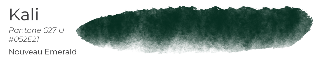
Kali MacDonald
Senior Designer
My favourite colour is the deep olive/emerald green that is Pantone 627 U. I think it feels like taking a deep breath of crisp woodland air. I have a wingback chair in this colour that I use for reading so I’ve romanticized the colour quite a bit. I’ve always associated it with the mix of comfort and luxury you see in old Art Deco and Art Nouveau designs and architecture so it makes me feel nostalgic.
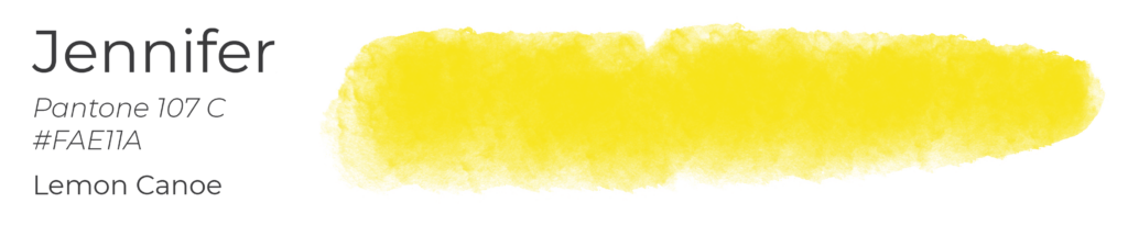
Jennifer Young
Senior Designer
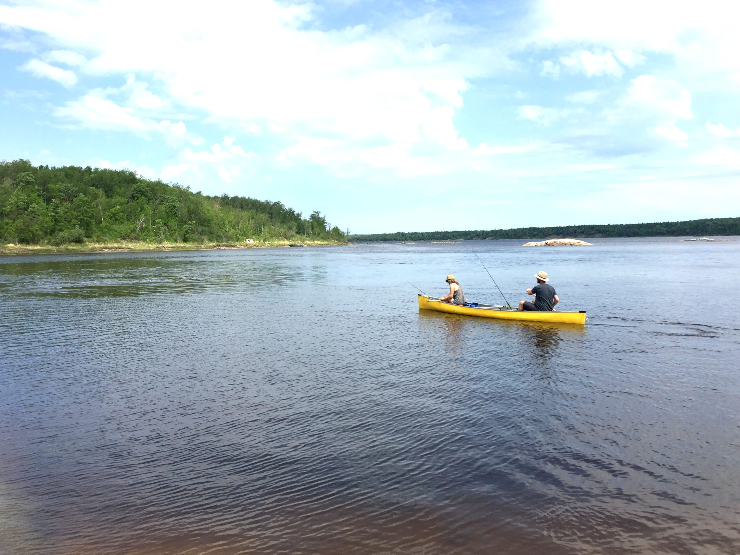
Mine would be Pantone 107c, the colour of my family’s bright yellow canoe. We paddle along the river, stopping to explore the shoreline as we go. You never know what you might encounter, from snapping turtles to a fellow paddler out on the water. It’s fun to see everything new through the eyes of my toddler, who is spending his first summer on the water with us this year.
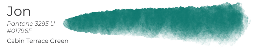
Jon Denby
Graphic Designer
Pine green #01796F is the colour of my family’s cabin. Since I was kid, I’ve always loved going there, even though it is a bit of a drive from Winnipeg. It has always been my favourite place for spending time with family, swimming and canoeing. The green is also a great colour that’s calming and just nice to look at.
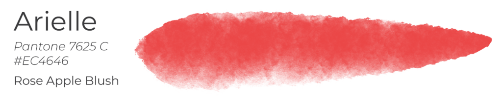
Arielle Villarin
Graphic Designer
The honour of my favourite colour goes to a warm canary, almost golden yellow. This colour (#EC4646), however, is the closest colour to rose apples (which, to be honest, are more of a light, almost white to pink gradient in real life). My grandparents’ house had a huge garden, tended by my grandma. There was a huge rose apple tree that we’d harvest with a long stick with a piece of wire at the end. Sticky hot summers capped off with a delicate, refreshing sweetness of a rose apple—something I haven’t had since 2004, probably, but I still remember the taste.
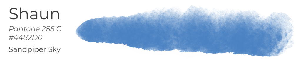
Shaun Vincent
Founder, Creative Director
Growing up, I spent an incredible amount of time outdoors. From the time I was 10 weeks old, my parents would camp for almost two months on the beaches of St. Laurent, Manitoba, including Sandpiper Beach, back in the days when you could back in your car right along the shoreline. After all the years, including those with my own babies sleeping in the bottom of my canoe, blue by far has the most memories for me. Sky blue specifically, when the sky meets water at the horizon and it’s like you can swim into the sky itself. Pantone 285 does it for me.
“I found I could say things with color and shapes that I couldn’t say any other way.” – Georgia O’Keeffe
Colour evokes feelings and brings meaning to experiences, in the brands we work on… and in our lives.