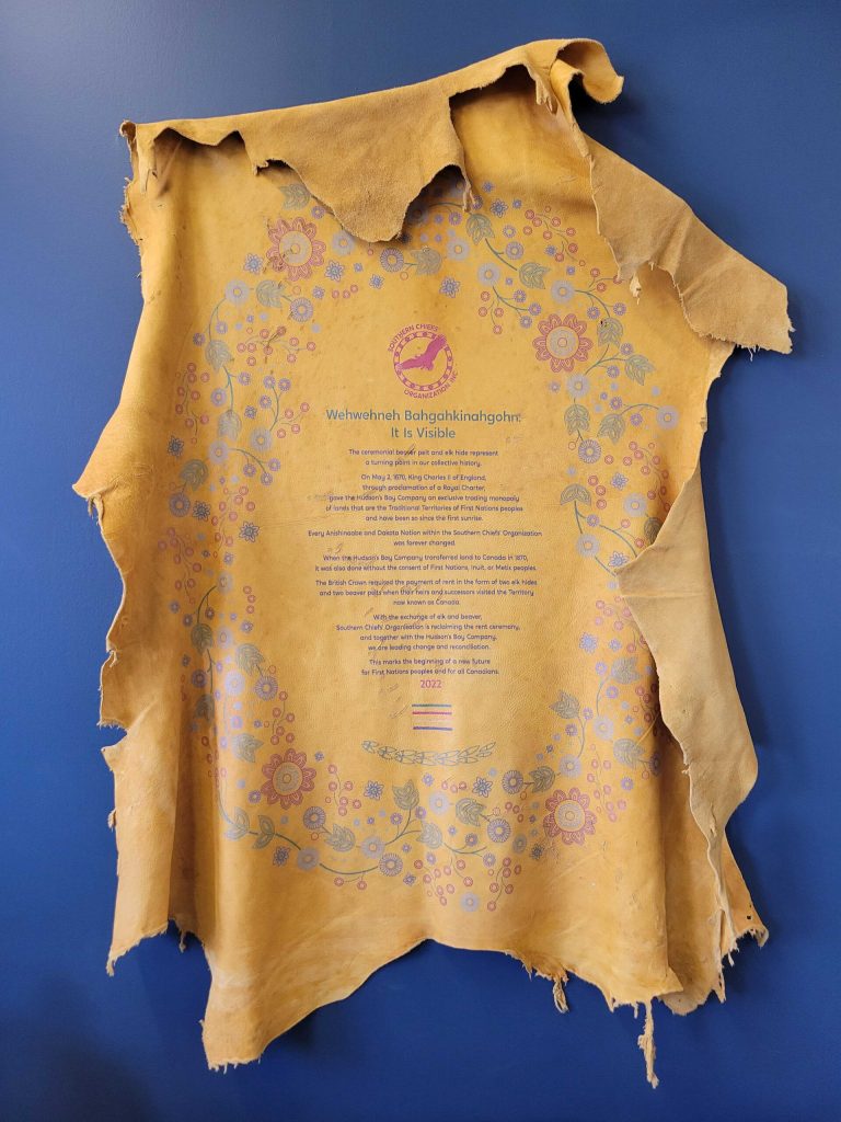
Wehwehneh Bahgahkinahgohn
It Is Visible
PAST, PRESENT, FUTURE
The Hudson Bay Company’s flagship store at 450 Portage Avenue opens November 18, 1926.
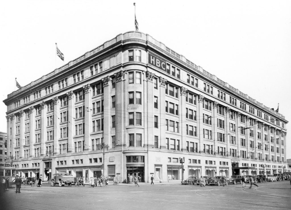
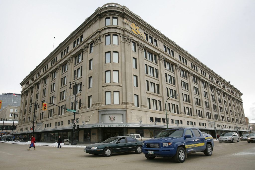
After 94 years as a shopping destination, the store closes on November 30, 2020.
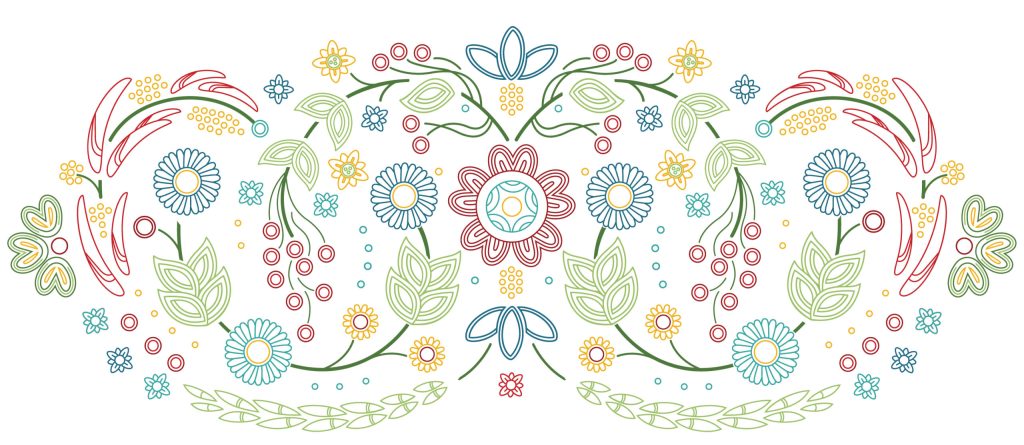
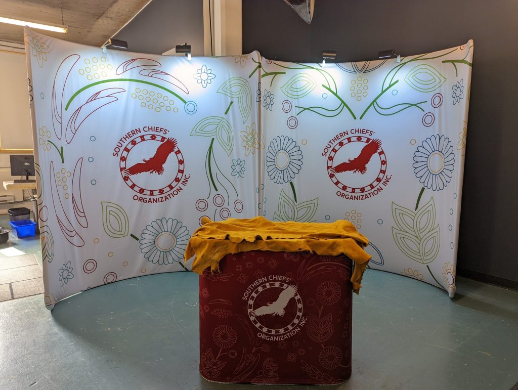
The 34 floral elements found in the motif represent the 34 First Nations represented by the Southern Chiefs’ Organization.
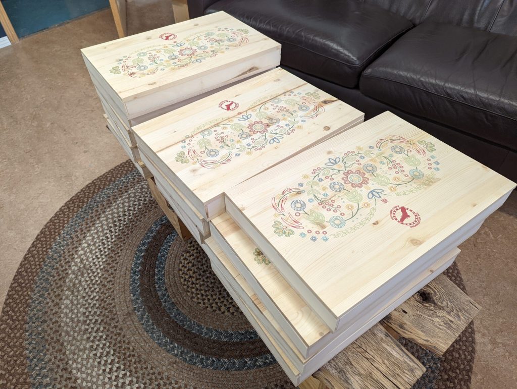
March 19, 2021 First boxes created to ship the proposals to decision-makers.
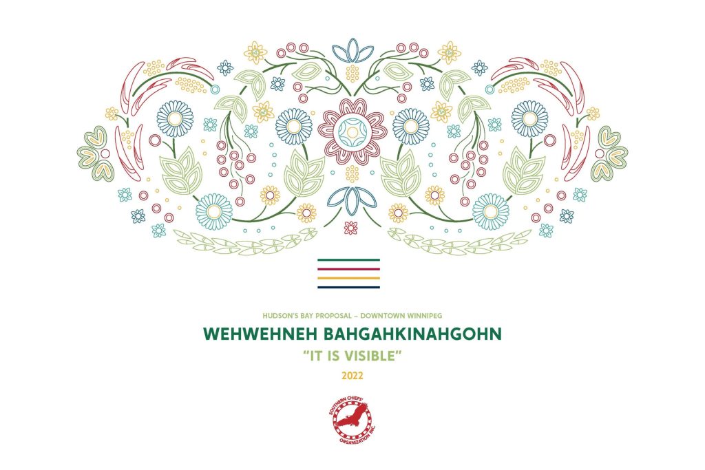
Proposal Report Cover
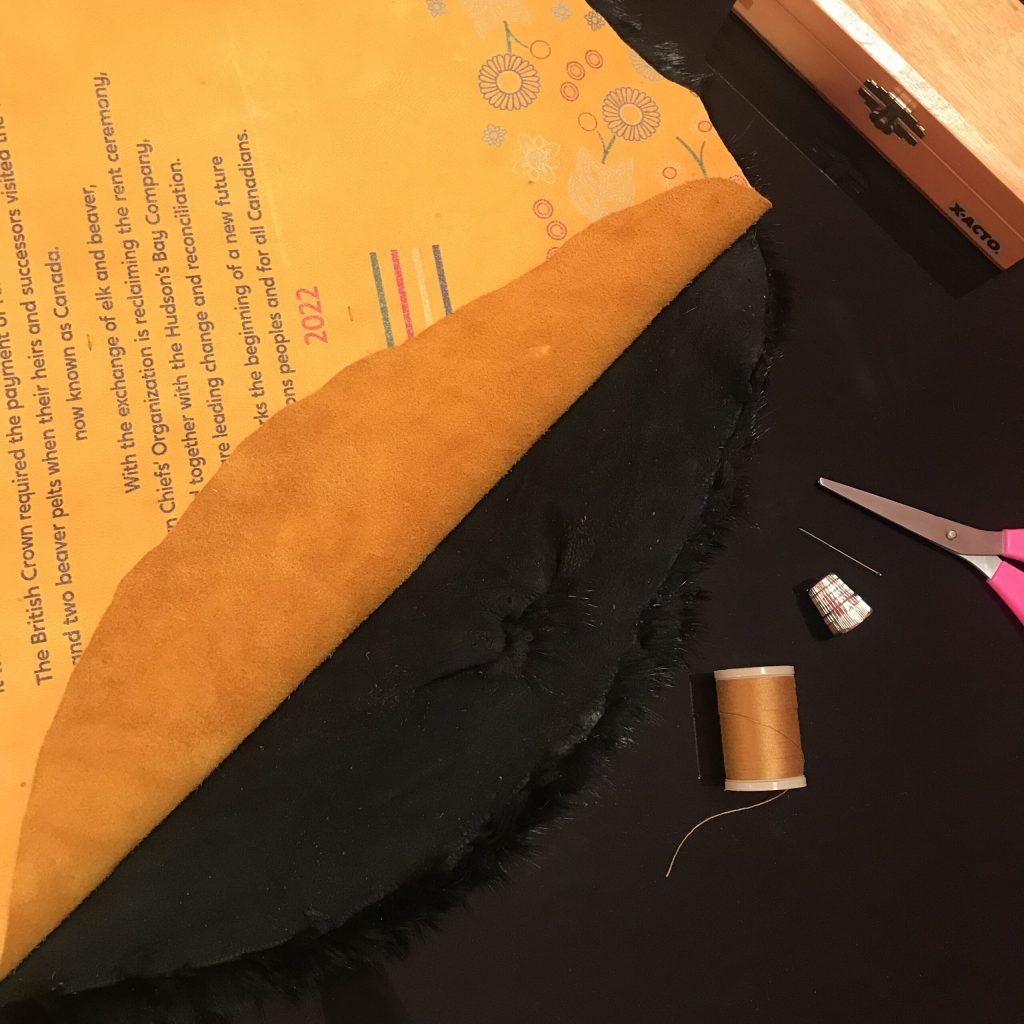
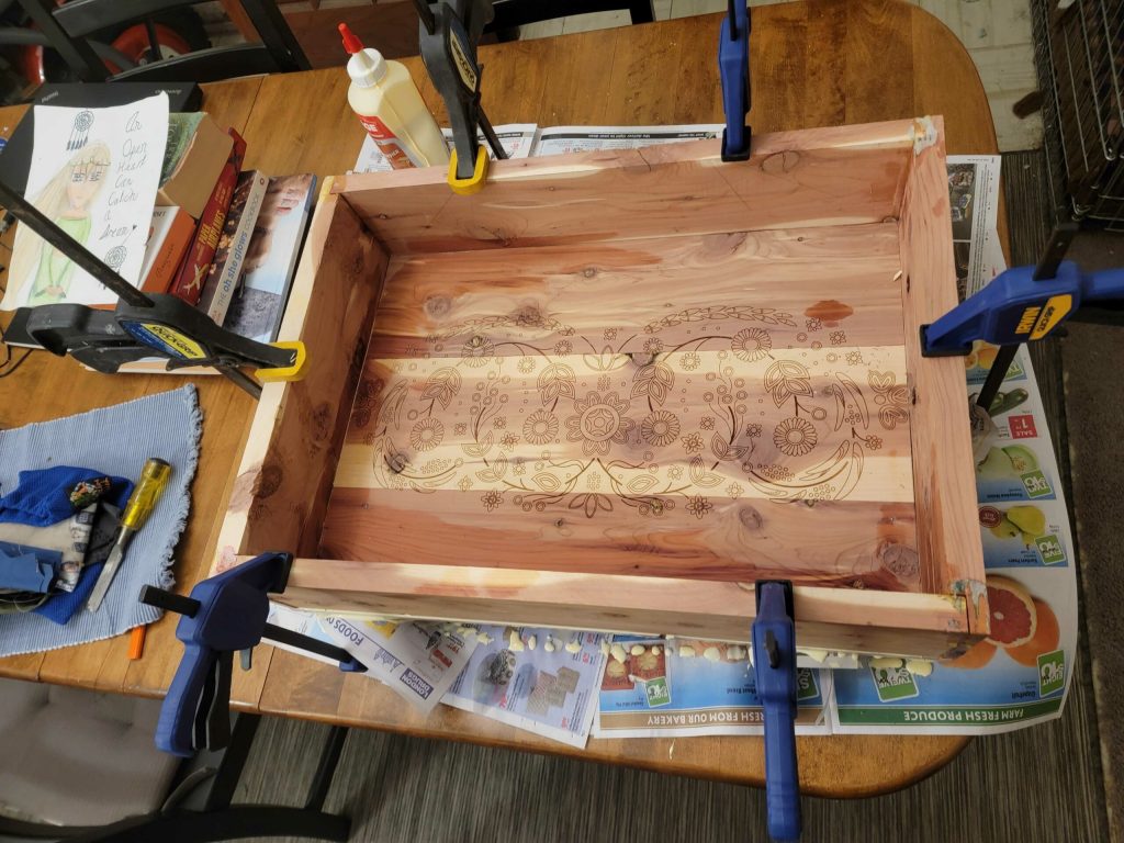
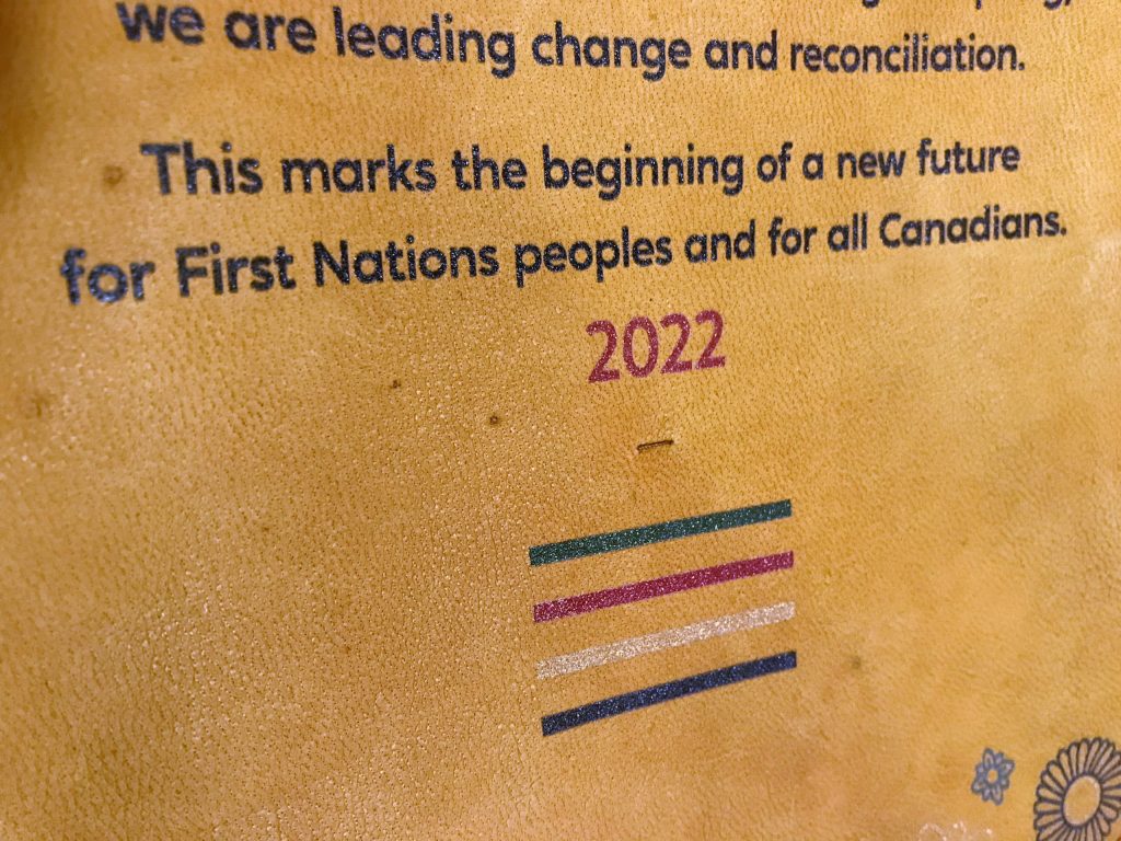
Stitching the pelt and hides, and box building for the rent ceremony, April 21, 2022.
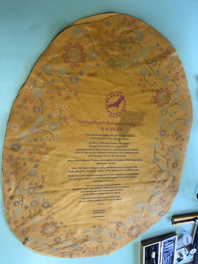
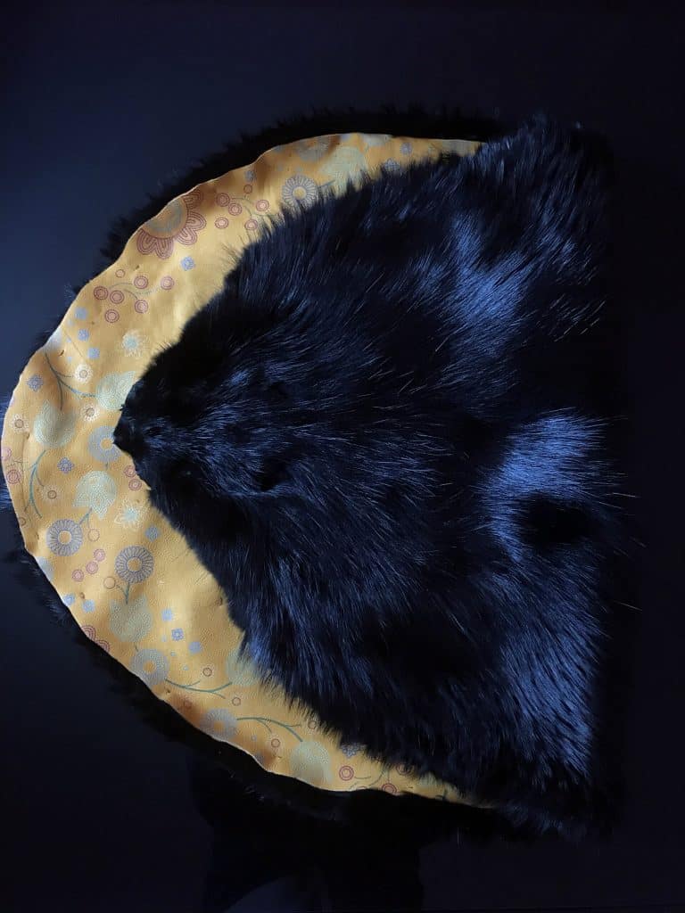
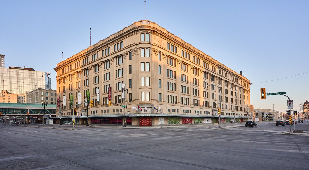
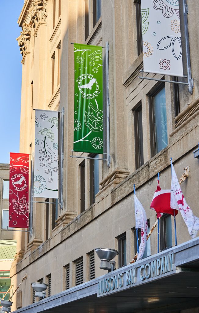
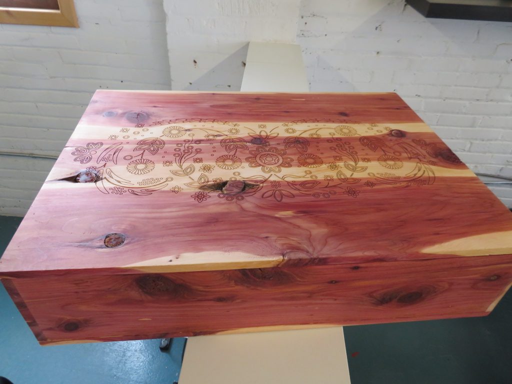
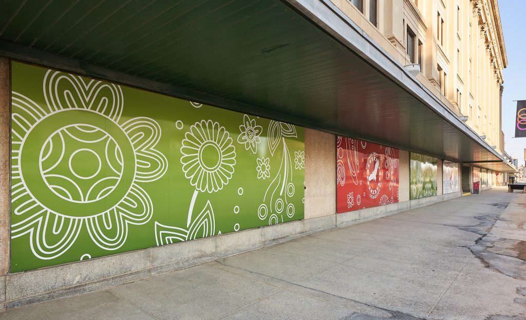
Banners, building placards, flags, ceremonial hides and presentation boxes all featured elements of the floral motif and were completed and in place on April 21, 2022, just one night before the gifting ceremony.
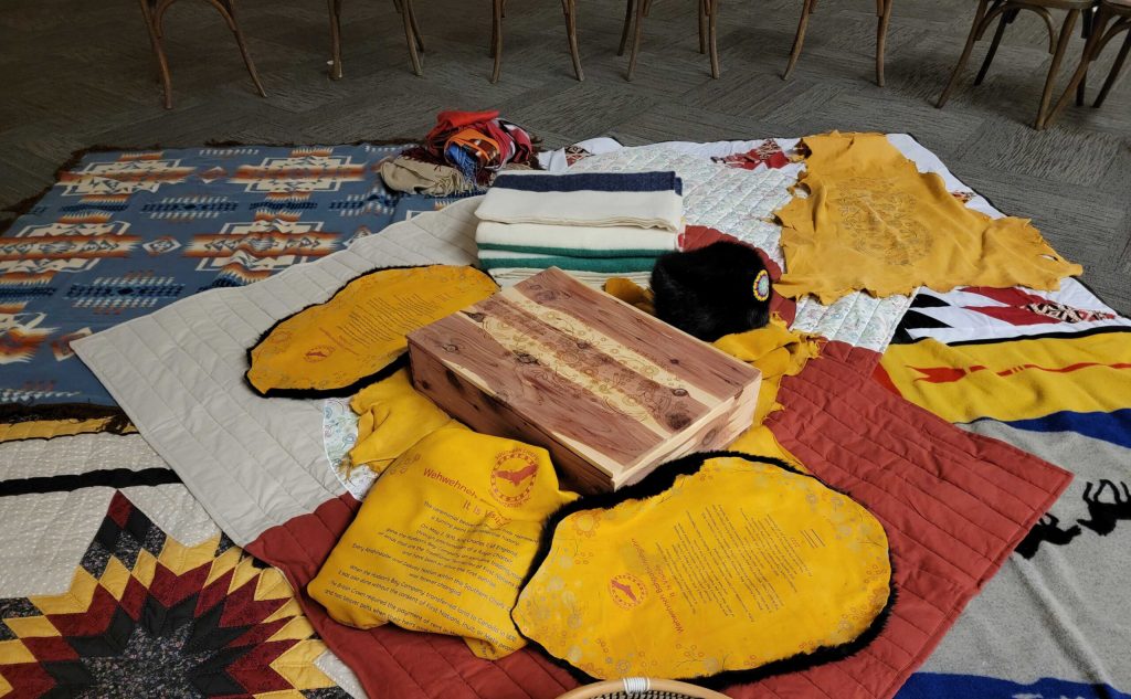
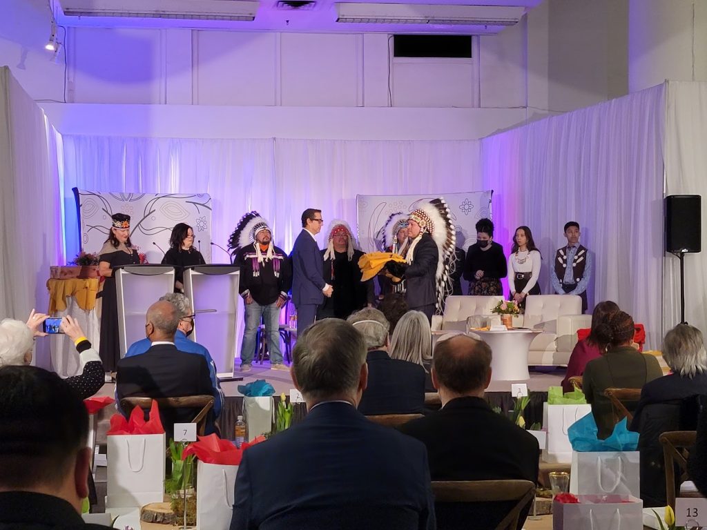
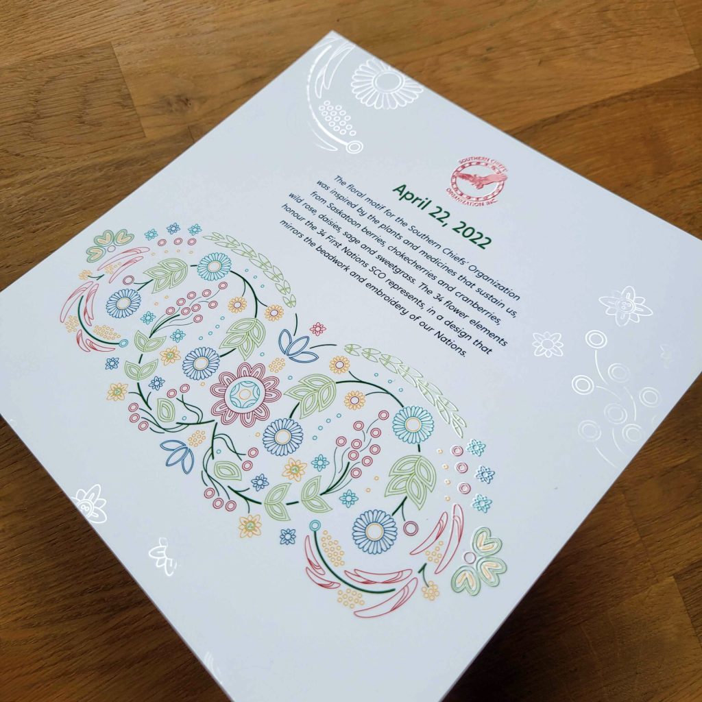
Program, backdrops and the presentation of the ceremonial elk hides and beaver pelts, April 22, 2022.
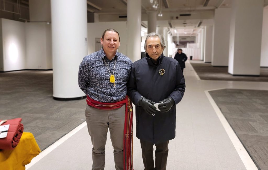
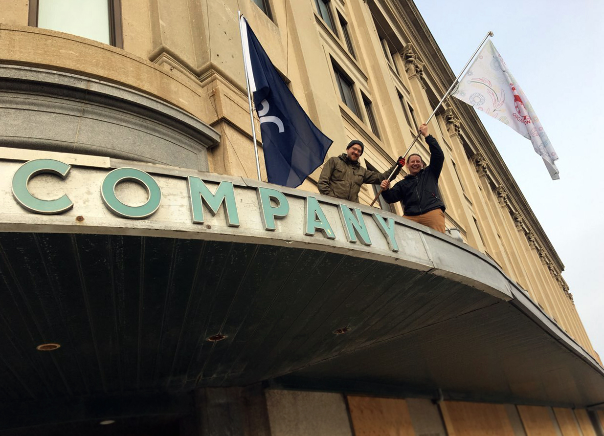
It was Thursday evening, April 21, 2022 and Shaun Vincent was standing atop the canopy of The Hudson Bay Company’s landmark building at Portage and Memorial. As he maneuvered a flagpole into a fixture he helped fabricate in the building’s archaic metal shop earlier that day, he felt the pieces falling into place.
“We were up there planting a flag; reclaiming the building for a new purpose,” said Shaun, Vincent Design’s founder and creative director. The news had hit media outlets that same afternoon: the Southern Chiefs’ Organization was set to acquire the nearly century-old heritage building.
The official announcement would happen in a ceremony the next day, the result of months of planning and work behind the scenes to ready the materials and building for the chiefs, leaders and dignitaries including HBC executives, the mayor of Winnipeg, premier of Manitoba and Canada’s prime minister.
The project is called Wehwehneh Bahgahkinahgohn, or It is Visible, a name that recognizes that Indigenous people involved in the fur trade were overlooked in the story of Canadian history.
The limestone relic of trade and retail will be reimagined to create housing, a museum and art gallery, and two restaurants… a place that will make a difference for Indigenous people and the future of downtown Winnipeg.
This is the story of our small role in a significant act of reclamation and reconciliation.
It was early in 2021 that Shaun recalled being asked by SCO’s Chief Operating Officer, Jennifer Moore Rattray if he had time to discuss a new project. But before anything more could be shared, he and any other Vincent Design staff involved would have to sign a non-disclosure agreement. NDAs aren’t unheard of in the work of design, whether it be for financials and reports that are embargoed until publication date, or keeping a brand reveal confidential until it goes public. This, however, felt different from the start. On February 26, 2021 the email requesting team members’ NDAs arrived. Shaun arrived at a code name for a core group of employees assigned to the project to use. It was Cannons, for the artillery HBC used to protect their forts.
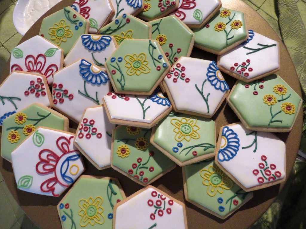
It was relatively early in Vincent Design’s working relationship with SCO. Previously, Shaun had designed a floral pattern as part of a logo redesign for the core brand of the Southern Chiefs’ Organization. While the logo did not ultimately go forward, the floral design became one that could be put to use in a refresh of the brand. The flowers in the motif represent nature, growth and the plants and medicines important to the 34 First Nations of SCO and the Anishinaabe and Dakota people. The pattern became the common element in everything associated with the project launch, from the report and building renderings, banners, window displays and backdrops to the invitation and program, ceremonial hides and blankets… and even the icing piped onto the cookies served at the event.
When Jennifer and CEO Joy Cramer told Shaun the project would be a new life for the The Bay building, Shaun said he was all in.
“I was so happy it was going to an Indigenous organization and I knew it was something I wanted to be part of.”
Shaun, like many Manitobans, had memories of shopping at The Bay and going to the Paddlewheel restaurant growing up. “I believe that every house — every building — has a spirit. The Bay has its own spirit.” While the Hudson Bay Company’s history is part of the history of colonialism, this project is one to reclaim it for good things to come, he said.
One of the first tasks was designing the proposal report. The first draft was ready on March 22, 2021. This document and its management fell to senior designer Kali MacDonald. Tracking the multiple versions of the report and recipients required attention to detail, a strength Kali has found in her ability to hyperfocus, a trait that arrives with attention deficit hyperactivity disorder (ADHD). Kali estimates saving more than 30 versions of the report as things shifted in the year before the announcement. With a document of its size and the need to keep it secure, she recalled praying, “please save, please save” as her computer chugged through the files.
Another challenge was arriving at a memorable way to present the proposal to decision-makers at all levels.
Shaun worked with Kurt Cosgrove of City Press to create a prototype that included printing the motif on the lid of the baltic birch plywood box. Kurt was also integral to the success of the project, from finding methods for printing the different materials and being a partner Vincent Design could count on. The prototype was completed on March 19, 2021. The boxes were wrapped in elk hides, also printed with the motif. Coming up with ways to use natural materials was a theme throughout the project, and often one of the unique aspects that included sourcing hides and finding a supplier of sweetgrass braids in the dead of winter.
Office administrator Doris Quill tracked the boxes enroute to their recipients. When she thinks of the project moving forward, “I try to put myself in the tenants’ shoes when I imagine construction is finished and the building transformed to provide housing for families in need.”
Innovation, adaptation and problem-solving were part of the journey to the gifting ceremony on April 22, 2022.
Research, an important part of any project at Vincent Design, was also crucial to understanding this one. When Shaun added copywriter Claudine Gervais to the project team, it was with a series of links to articles about the history of Hudson’s Bay Company and the rent ceremony.
According to the Hudson Bay Company’s royal charter of 1670, the rent of two beavers and two elk was to be paid by HBC whenever a British monarch visited Canada. The ceremony was only performed four times. This informed the copy printed onto the hides and pelts presented to Richard Baker, the governor and executive chairman of the Hudson’s Bay Co., as a symbolic payment for the building.
Graphic designer Renée Campbell stitched the printed elk hides to the black beaver pelts. “It was an honour to be entrusted with stitching these pieces,” said Renée. “Due to the nature of the materials each step had to be executed in one pass – resulting in the luscious beaver pelt fur and the smooth elk hide being joined beautifully together,” ready for their ceremonial purpose.
Shaun completed the box to hold the gifts the day before the ceremony, in time for it to be blessed along with other items in a ceremony before the Friday afternoon event. He was thankful to have the support of a neighbour in the Social Enterprise Centre – the Manitoba Institute of Trades and Technology’s woodworking shop for their expertise and equipment. Made from red cedar, the box was also laser-engraved with the floral motif by Westwood Memorials.
The night before the event, while Shaun was affixing the SCO, HBC and Canadian flags to the canopy, Mark See and his crew from Jade SignWorks were installing the window panels and banners. Coordinating a last-minute reveal after a long harsh winter and continuing inclement weather required familiarity with the building through site inspections and careful planning and coordination.
Senior designer Jennifer Young, who worked on design and production on many of the project deliverables, said the limited time frame for their reveal was difficult, however the reward was in the details, including her favourite piece: the program. It was printed on a heavy, soft-touch paper stock with a clear raised varnish of the motif subtly layered over top, visible when caught in the right light.
“It stands as an example of the type of project we take on as an Indigenous firm, layered with meaning.”
Accounts manager Chris Redekop organized production and pitched in wherever he was needed, including finding podiums on short notice that were more fitting with the event environment than those originally planned. He said being able to revisit The Bay building was a surreal experience, from seeing the Paddlewheel’s kitchen left as it was on its last day, to having a view to the service corridors and building works that were in place from the building’s earliest days. While he had worked to help coordinate events of a similar scale for Vincent Design clients in the past, this project was different. “It stands as an example of the type of project we take on as an Indigenous firm, layered with meaning,” he said.
