Branding • Graphic Design
Lake of the Woods Chiropractic & Wellness

Briefing
LOTW Chiropractic & Wellness wanted a logo that separates them from industry competitors and highlights the connection to their region while avoiding the typical tropes of chiropractic work.
Approach
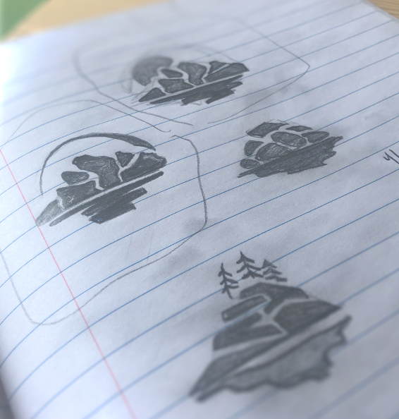
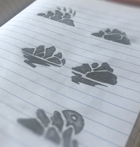
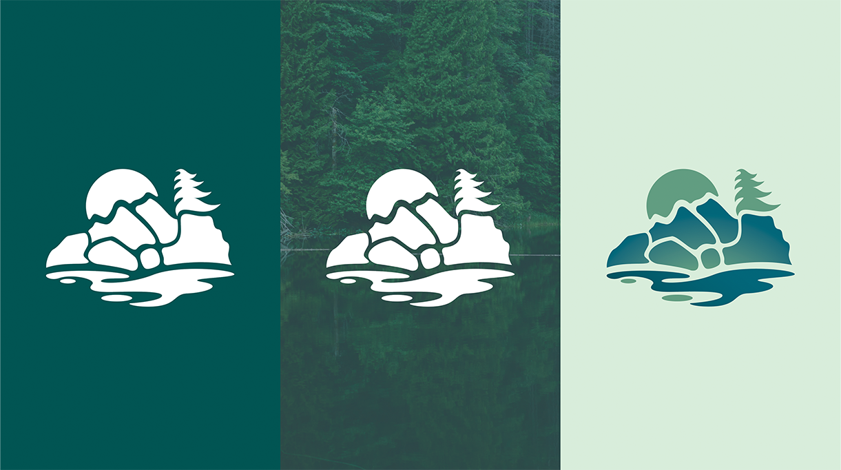
We subtly combined Canadian Shield rock imagery with forms borrowed from illustrations of vertebrae to convey the identity of Lake of The Woods and chiropractic practice with a typography that compliments the icon by setting a friendly, professional and welcoming tone.
Responsibilities
- Branding
- Logo
Client
LOTW Chiropractic & Wellness
Result
The focus on the rocks, spruce trees and lakes that make up the landscape of the region is combined with a cool, earthy colour palette in a unique logo which feels natural as well brings a sense of calm and wellness.