Branding • Marketing • Web Design
CropConnect Conference

Briefing
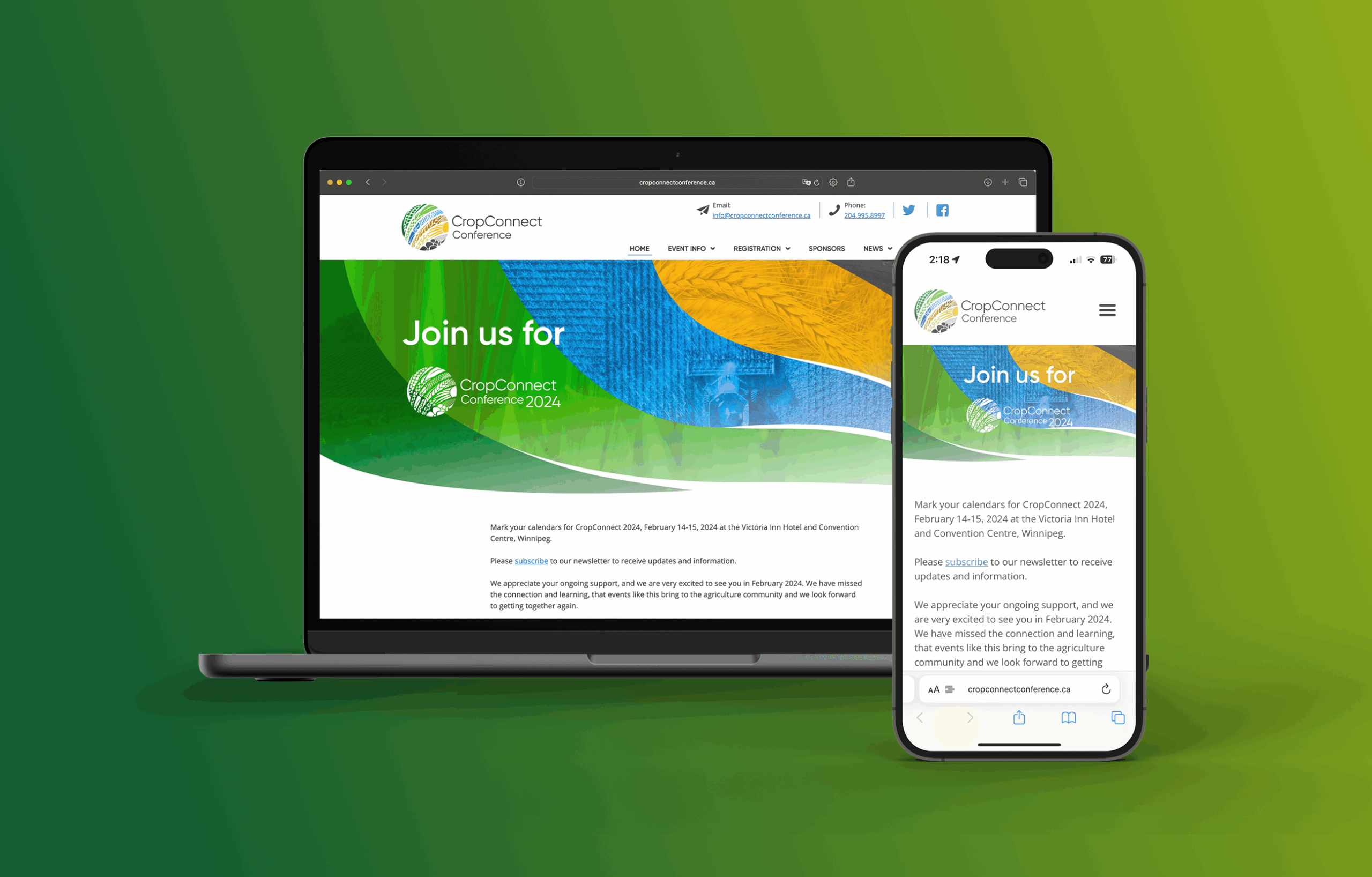
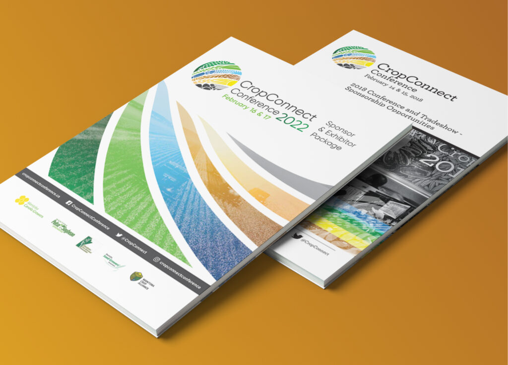
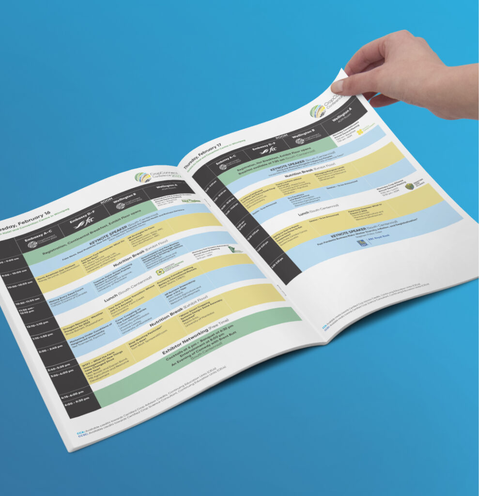
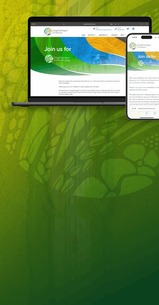
The six leading crop organizations in Manitoba needed a streamlined visual representation of their joint conference that showcased them all at once on a new website, promotional materials, and show guide.
Approach
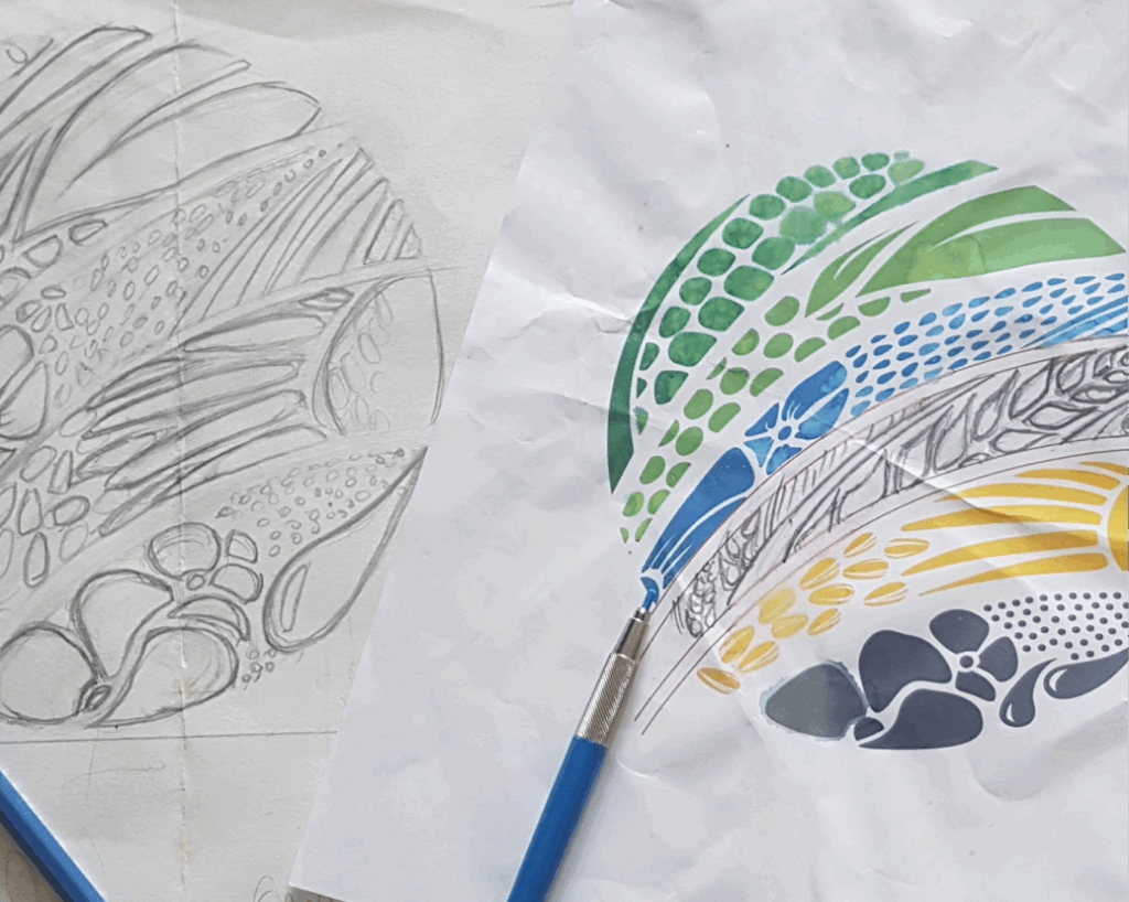
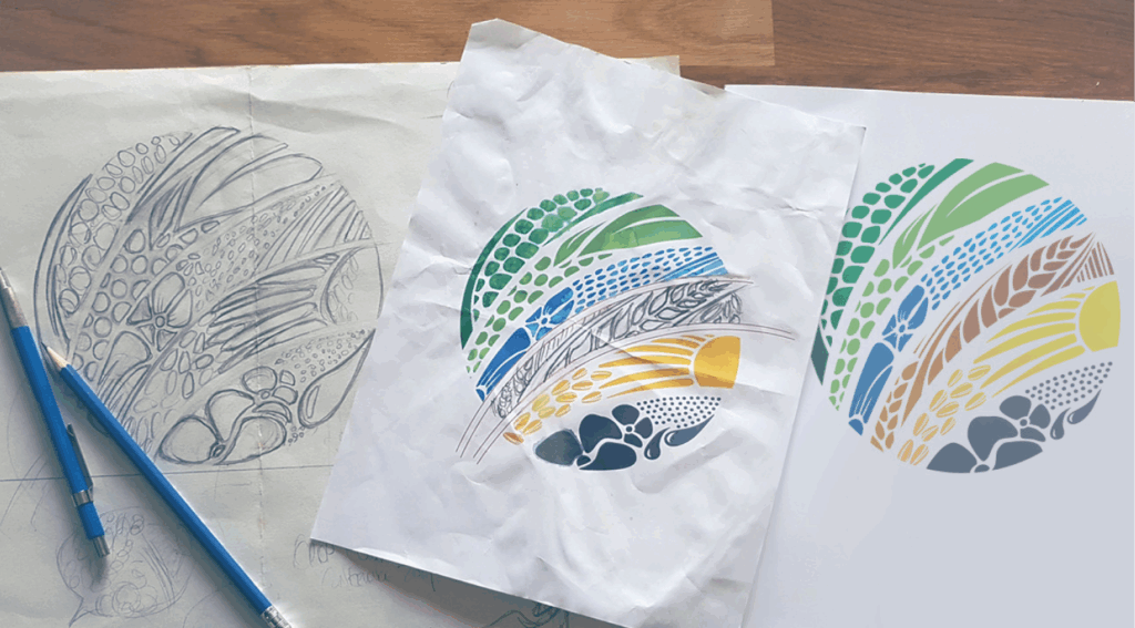
Colour was sampled out of each plant crop and adjusted for balance; the sun is represented by the circular design to symbolize growth and balance and to contain all the six different crop shapes.
Responsibilities
- Art Direction
- Branding & Identity
- Copywriting
- Digital Strategy
- Front-end Development
- Interaction Design
- Print Design
- Responsive Web/UI Design
Client
Result
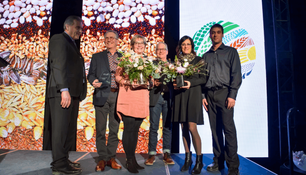
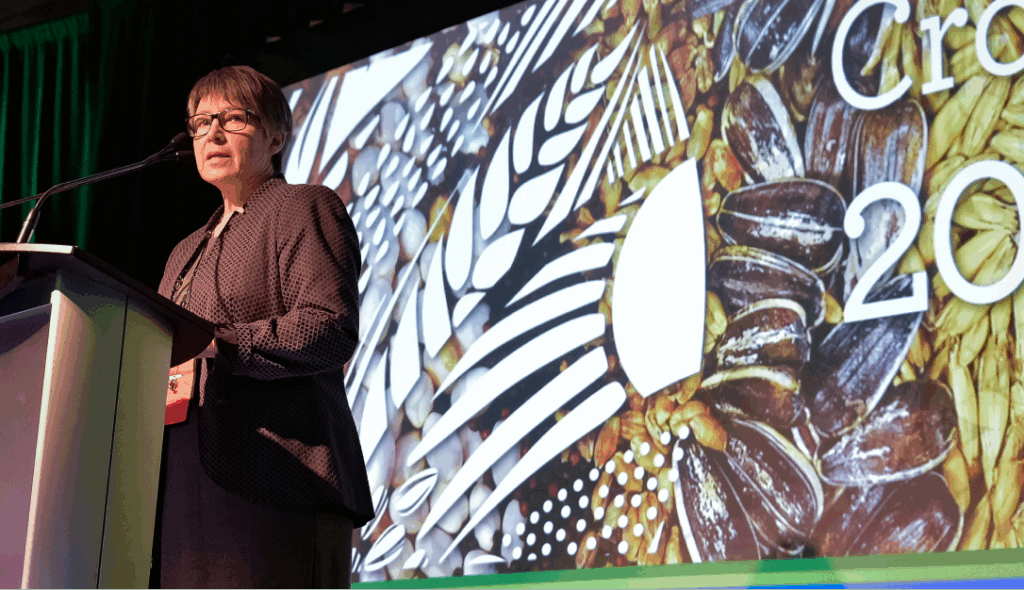
A beautiful, versatile, highly visible logo, evenly representing all the participating industries; the website mirrors the brand and allows registrants to easily access the full program of speakers and events.