Animation • Branding • Graphic Design • Logo • Web Design • Web Development
Manitoba
Ombudsman
Briefing
The Manitoba Ombudsman came to Vincent Design with the need for a refreshed brand presence and a modernized website that would better serve the public. Their existing site was outdated and difficult to navigate, with much of the content hidden within the structure, making it challenging for users to locate the right information. This led to frequent issues with people submitting the wrong forms—or avoiding forms altogether and using the general contact form instead. The content itself was often dense and technical, which created additional barriers for users seeking support or clarity.
A key priority in the redesign was to simplify language, improve navigation, and create a user-friendly experience that guided visitors toward the correct resources. The design also needed to provide clear context about what an “ombudsman” is, since the term and role are often unfamiliar to the general public.
Alongside the website redesign, Vincent Design was also tasked with developing a video to clearly and concisely explain the role of the Manitoba Ombudsman and outline the complaint process. This video would serve as an accessible resource for Manitobans, offering a straightforward way to understand the office’s purpose and how it could help.
Responsibilities
- Branding
- Brand Application
- Design
- Layout
- Logo Design
- Visual Identity
- Web Design
- Web Development
- Video Storyboarding
- Video Production
- Video Treatment
- Video Editing / Post-Production
- Animated Video
- Scriptwriting
- Sound Design
Client
Approach
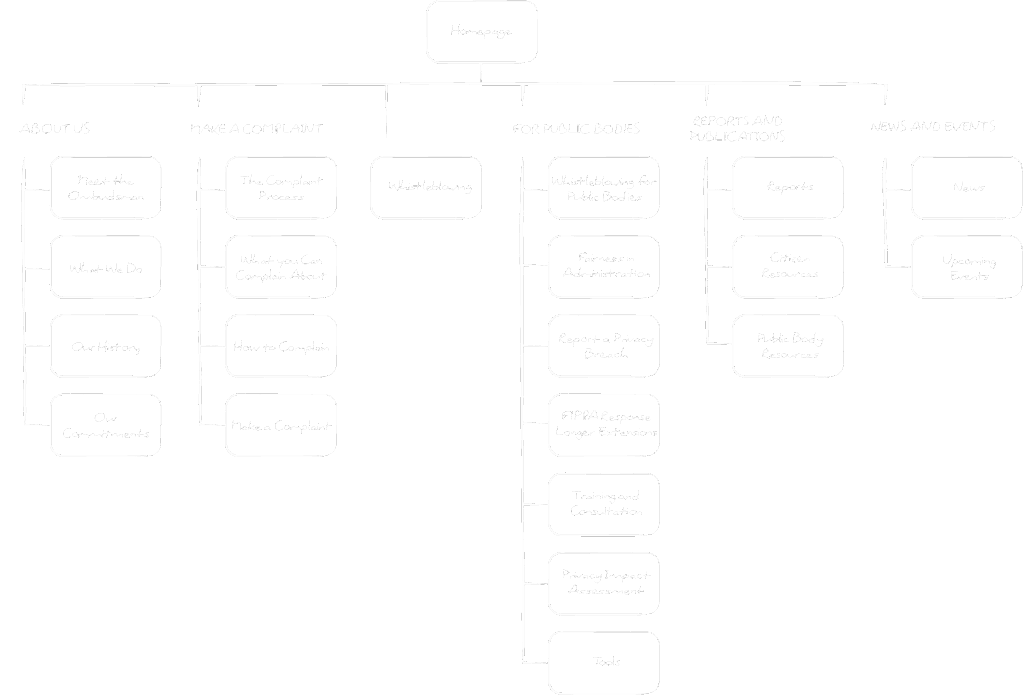
Our approach centred on creating a clear, intuitive user journey that would make it easier for Manitobans to find the information and resources they needed. Unlike many other ombudsman offices that oversee a single area of authority, the Manitoba Ombudsman manages three distinct pillars. This added complexity meant the website needed a structure that could organize information effectively without overwhelming the user.
To achieve this, we rethought the information architecture, streamlining how content was presented and ensuring that key resources were easy to access from the main navigation. Plain language became a priority, helping to make the site more approachable and reducing confusion for visitors. By combining clarity in both design and content, we aimed to guide users through the process with confidence and simplicity.
Results
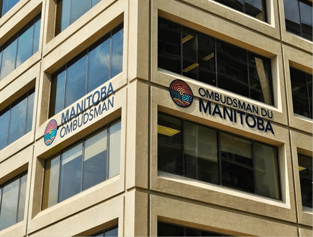
The refreshed branding and website gave the Manitoba Ombudsman a modern, professional look that reflects the scope of their work while remaining approachable for the public. Because the office oversees three distinct pillars of authority, the new branding system was designed to be flexible and adaptable—allowing for clear differentiation across the website, internal materials, and communications with aligned departments.
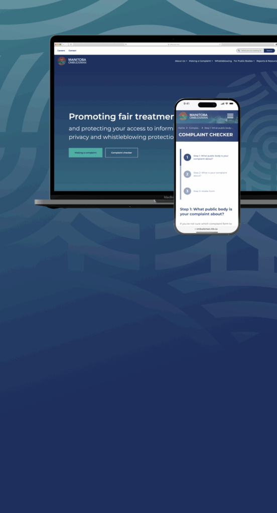
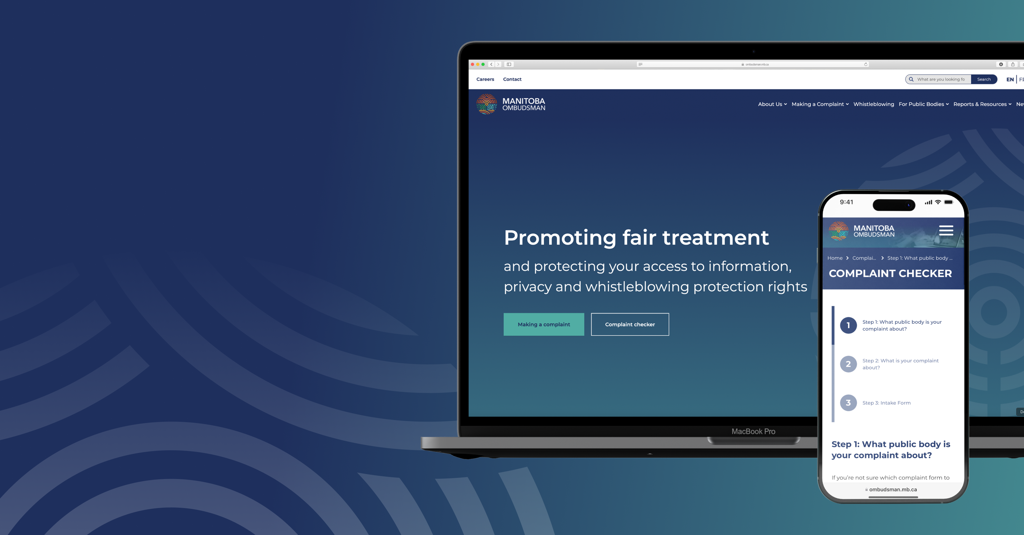
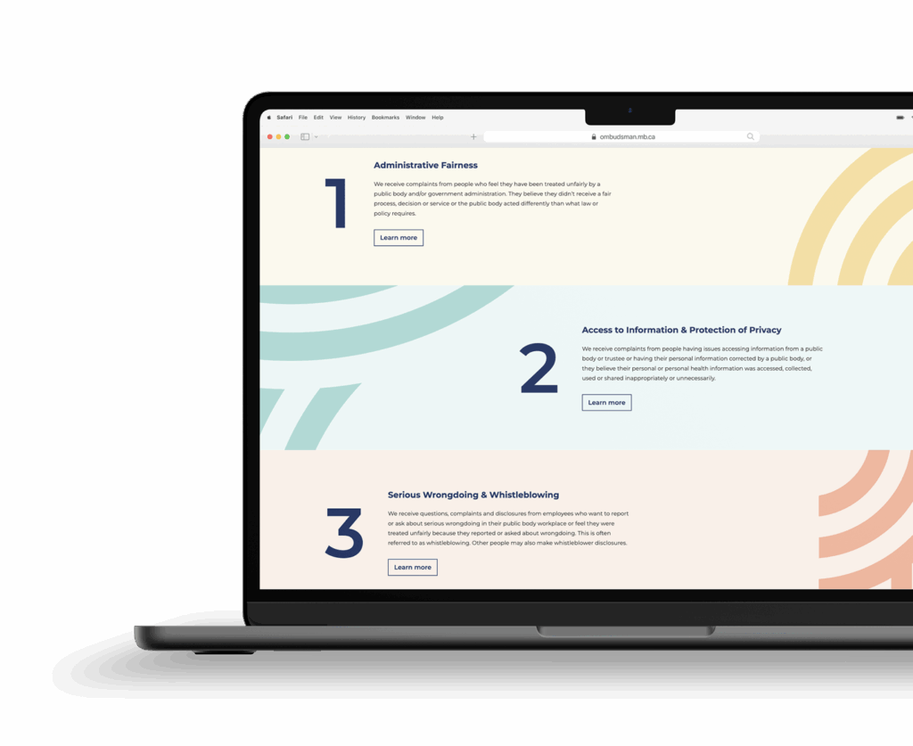
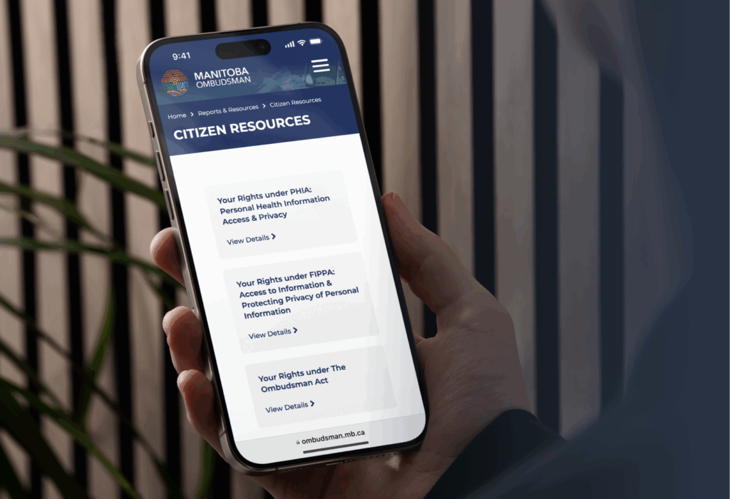
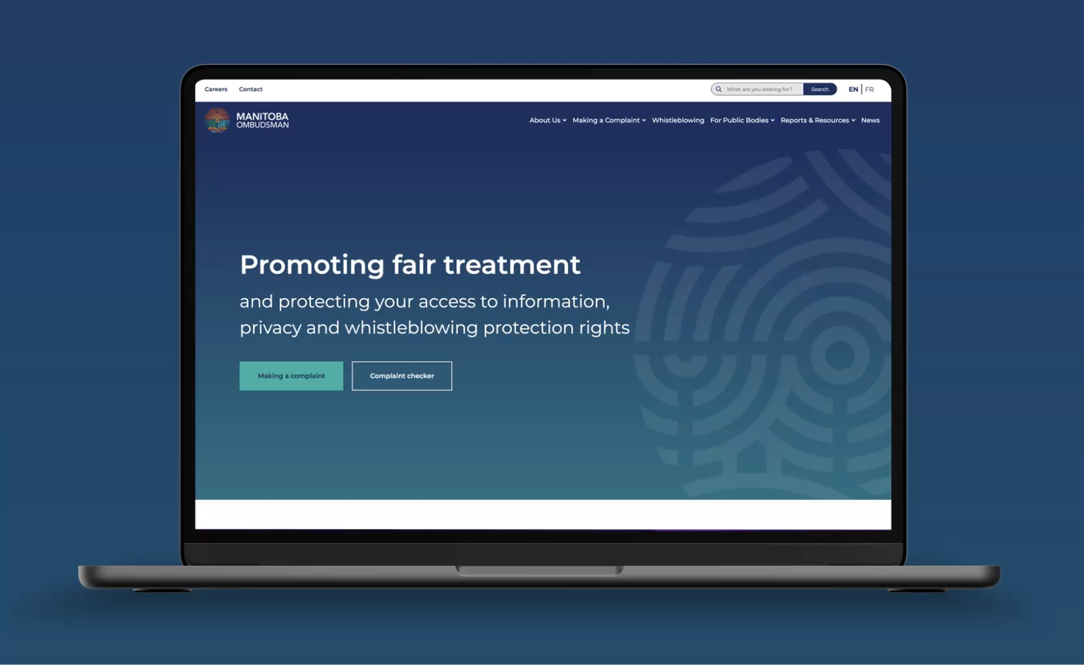
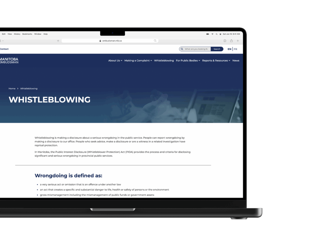
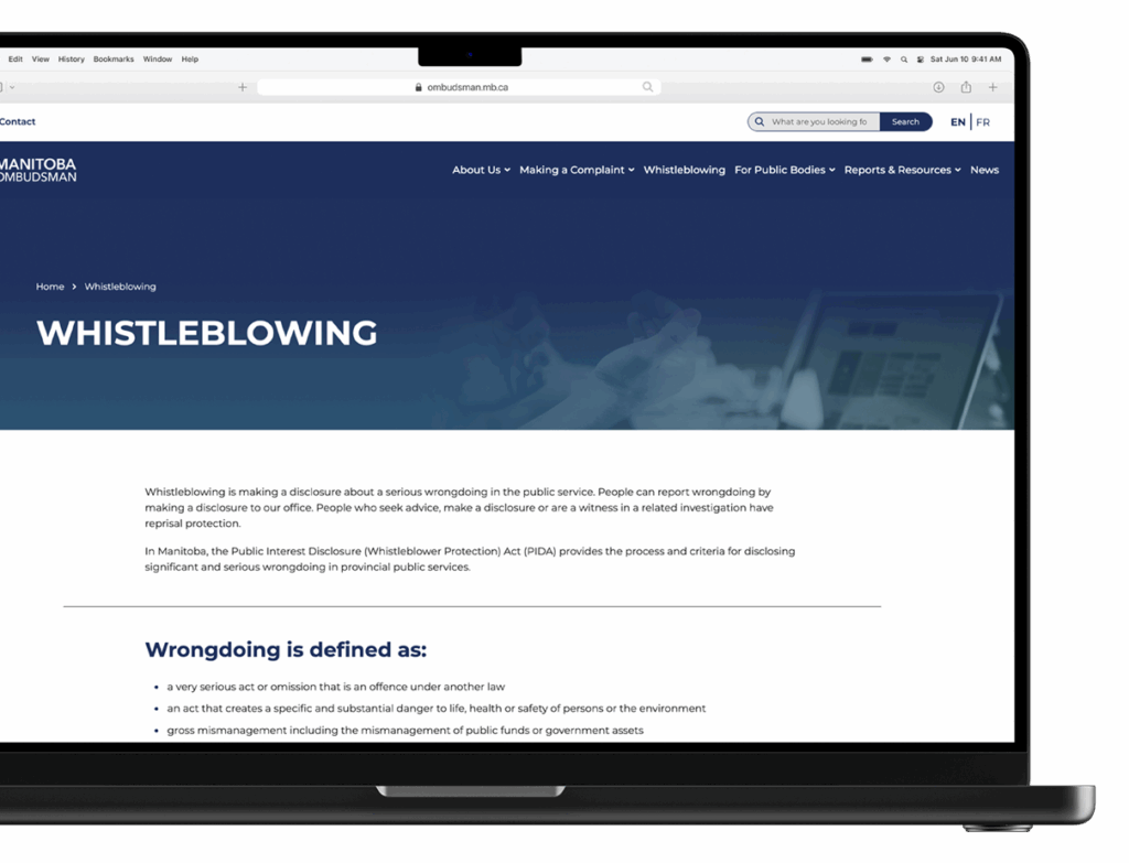
The redesigned website now offers a seamless user experience, with a simplified navigation structure and plain-language content that makes it easy to understand what the office does and how it can help. A major highlight is the new complaint tool, which was carefully iterated and refined to reduce complexity. What was once a confusing and often frustrating process is now an intuitive step-by-step journey that ensures both new and returning users can easily find the right resources and submit their concerns with confidence.
To further support accessibility and public awareness, Vincent Design developed a fully animated three-minute explainer video. Scripted, storyboarded, and produced in collaboration with the client, the video walks viewers through the complaint process, outlines what kinds of requests the Ombudsman handles, explains how complaints are received, and provides clear contact information. Together, the video and website provide Manitobans with a clear and approachable introduction to the Manitoba Ombudsman and the services it provides.
Content
The Manitoba Ombudsman’s website needed to serve two primary audiences: policy makers and government stakeholders, as well as the general public. Balancing these audiences meant dealing with a large amount of existing content that was often written in nuanced, technical language. To make the site more accessible, the client undertook a significant rewrite of the material to align with plain-language standards, ensuring clarity for all users.
On our side, careful research into information architecture was essential. We worked closely with the client to map out a clear sitemap and create a structure that supported both audiences while reducing complexity. This process also informed the design of the complaint tool, ensuring it was simple to follow and easy to use.
Because of the project’s scope, a series of detailed planning meetings were held early on with the client and development team. This collaborative approach ensured that all key stakeholders were consulted, expectations were aligned, and the project was carried out in a way that was both organized and effective.

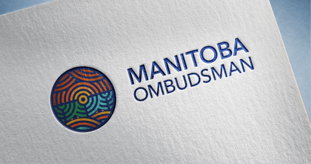
Logo Design
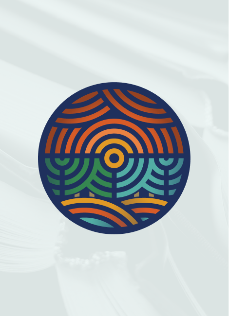
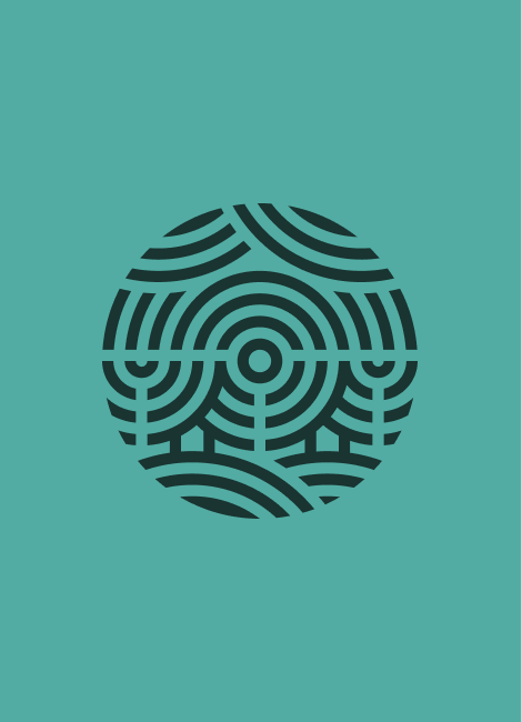
The Manitoba Ombudsman’s logo draws inspiration from the province’s natural landscape, using warm, vibrant colours to convey approachability and trust. Designed with equal balance on all sides, the circular form represents the impartiality and fairness at the heart of the Ombudsman’s role, as well as the citizen-centred service it provides. Within the circle, elements converge toward the centre, symbolizing guidance, connection, and balanced perspective.
Each visual element carries meaning. The sky and clouds represent influence and the ability to spark change, while the sunset conveys clarity and light. The spruce tree embodies support and structure, the lake symbolizes access and connectivity, and the prairie reflects stability and foundation. Together, these elements create a mark that is both welcoming and authoritative.
The logo was also designed with flexibility in mind. Its modular structure allows individual components to be highlighted as needed, supporting differentiation across the Ombudsman’s various departments. In a single-colour application, the mark takes on the appearance of a fingerprint, reinforcing themes of privacy, access, and individuality.
Sky/Cloud
Endless
Transformation
Protection
Sunset
New beginnings
Uplifting
Radiant
Spruce
Healing
Supportive
Growth
Prairie
Freedom
Sustainability
Heritage
Lake
Connectivity
Enriching
Reflective

Web Design
The website was developed to extend these brand values into a functional, user-friendly digital experience. Clean layouts, consistent branding, and a clear visual hierarchy ensure that information is easy to navigate and understand. Key tools, such as the complaint checker and online submission forms, were structured to guide users step by step, reducing confusion and improving efficiency. By pairing thoughtful design with purposeful functionality, the site now reflects the Ombudsman’s balance of authority and accessibility, while making resources straightforward and approachable for Manitobans.
Web Development
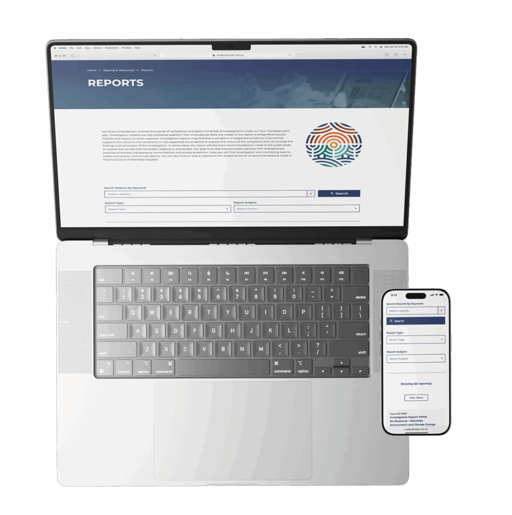
The web development process focused on transforming a large and complex body of information into a streamlined, easy-to-manage system. A major part of this work involved extracting years of data from the Ombudsman’s old website and converting it into a usable format. By restructuring the content for import into WordPress, we saved considerable time and effort for both the client and our team, ensuring a smoother transition into the new platform.
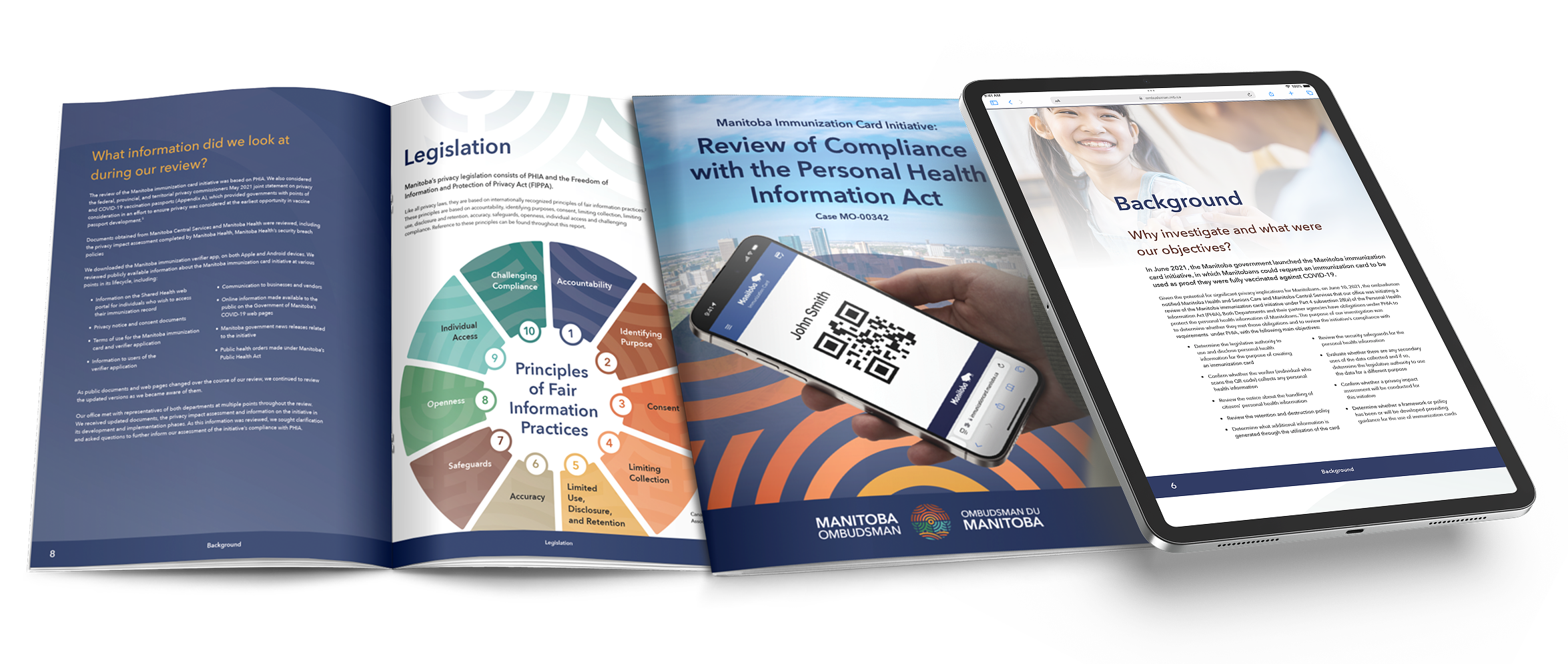
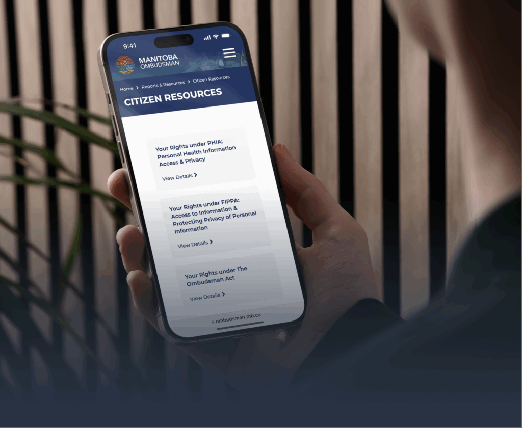
One of the most critical components was the report filtering system. Because the Ombudsman publishes a wide variety of reports, we developed a custom plugin to support advanced filtering. This included a two-level filter that allowed users to search not only by report type (the nature of the content) but also by report subject (the legislation under which it falls). This dual filtering system makes it much easier for users to find exactly what they need, whether they are members of the public or government stakeholders.
The site also needed to accommodate multiple kinds of content, from reports and news to events and resources. To handle this, we created custom post types that kept information organized and easy to access. Throughout the project, development and design teams worked closely together to review client and user needs, identify opportunities for improvement, and ensure that the final product was both visually clear and functionally intuitive.
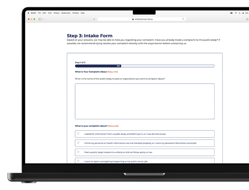
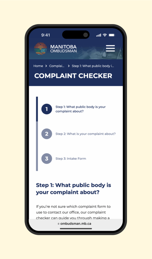
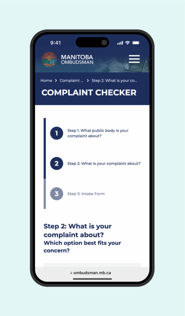
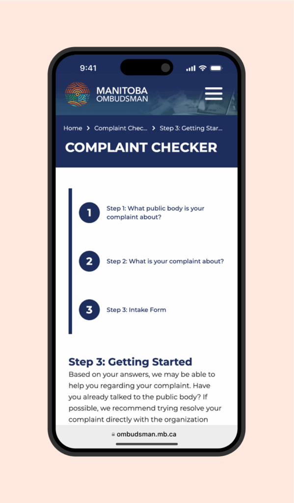
Complaint Tool
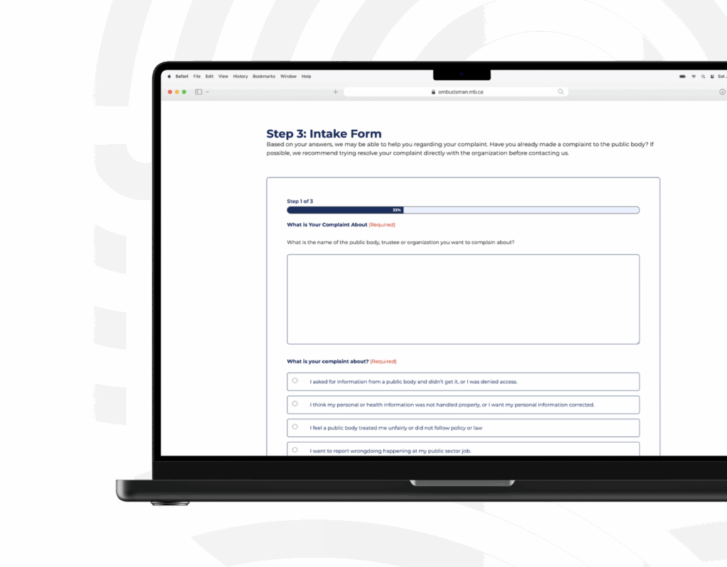
One of the biggest challenges identified early on was that users were frequently submitting the wrong forms—or bypassing them entirely in favour of a general contact form. To solve this, the client requested a decision-tree style complaint tool that would guide users toward the right resources, information, and forms.
Because of the complexity of this feature, a series of upfront planning meetings were held with the client, our development team, and a consultant who regularly works with the Ombudsman. Together, we mapped out the smoothest possible user journey, focusing on reducing confusion while keeping the process approachable. The client was strongly aligned with the goal of simplicity, ensuring that the tool would be accessible to all Manitobans.
From there, our development team created detailed planning documents that supported a seamless handoff and execution. The result is a streamlined complaint tool that takes what could be an overwhelming process and makes it clear, intuitive, and user-friendly. By guiding visitors step by step, it reduces errors, improves efficiency, and helps ensure concerns are directed to the appropriate place.

Accessibility
Accessibility was a key consideration throughout the project, influencing everything from button labels to the design and functionality of the complaint tool. We ensured that all features were compatible with assistive technologies, including screen readers and keyboard navigation, so that users with varying abilities could navigate the site and access resources independently.
Particularly for the complaint tool, extra care was taken to make each step accessible and intuitive, allowing users to complete the process without barriers. By prioritizing accessibility from the start, the website now provides an inclusive experience that aligns with the Manitoba Ombudsman’s commitment to serving all members of the public.
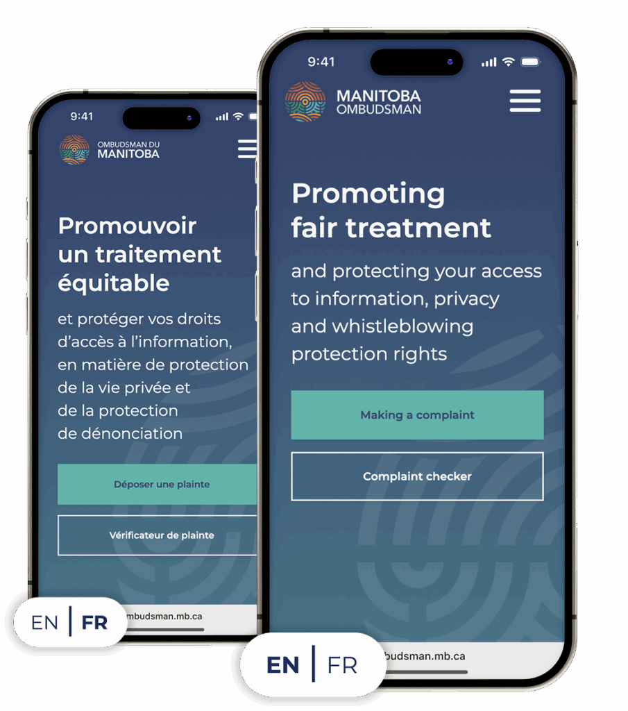
Bilingual Website and Content
All website content was provided and translated by the client, which required significant effort to manually integrate the French translations across the site’s extensive library of reports and publications. Careful attention was given to ensure that both English and French versions of the content were fully functional, easy to navigate, and consistent in structure.
The explainer video was also produced in both English and French, with custom captioning and transcripts added to meet accessibility requirements. This approach ensures that all Manitobans, regardless of language preference, have equal access to the information and resources provided by the Manitoba Ombudsman.
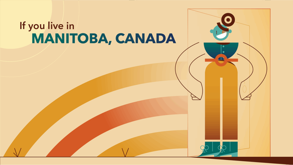
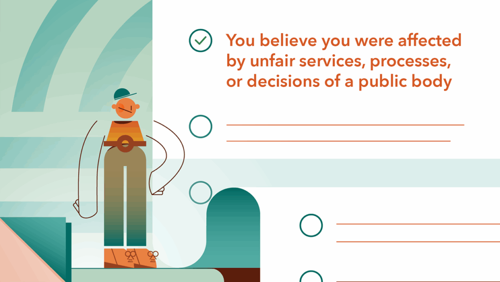
Videography
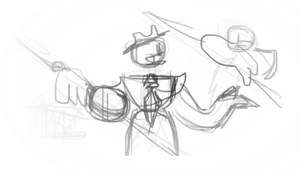
Animation was chosen as the medium for the explainer video to provide a concise, engaging, and accessible way for users to understand the complaint process and submit the correct forms. One of the key challenges was integrating the website content seamlessly into the video, while formatting it in a way that was visually appealing for both English and French versions.
The video’s design drew inspiration from geometric shapes and abstract character forms, complementing the Manitoba Ombudsman logo created by Vincent Design. Bold curved lines from the logo were incorporated into the character and visual elements, creating a cohesive connection between the video and the overall brand. Colours were pulled directly from the logo, with subtle tints used to maintain consistency and visual harmony. The design was intentionally balanced—simple enough to avoid clashing with website imagery, yet dynamic enough to remain engaging as a standalone piece.