Branding • Logo
SweetLeaf Cannabis and General Store

Briefing
Sweetleaf needed a brand that would deliver a message of quality while setting them apart from the competition, a concept that would flow through all promotional items and future brand development.
Approach
We decided to focus on the burgeoning market of professionals who use cannabis and developed a design that echoes the physical structure of the business itself: elements of nature, therapy and the young professional lifestyle are applied throughout.
Responsibilities
- Branding
- Logo
Client
Sweetleaf


Result
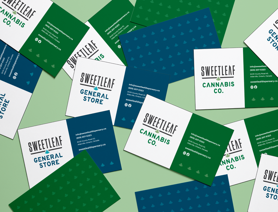
A balanced icon with soft colour against clean, dark, hard lines express wellness and recreation; a modern, fresh brand that applies extremely well across an array of product and promotional items.
