Branding • Graphic Design • Logo • Web Design • Web Development
CUPE Manitoba

Briefing
Vincent Design was tasked by the Canadian Union for Public Employees (CUPE) Manitoba with refreshing their logo, branding, and website. CUPE’s existing logo had been developed quickly for a campaign and, while functional at the time, did not reflect the union’s values or the trust they had worked hard to rebuild with their members. Similarly, their website had become outdated, underused, and difficult to navigate, with limited current information available. CUPE needed a new visual identity and digital presence that better represented their work and created a more accessible, engaging experience for members.
Responsibilities
- Branding
- Brand Application
- Design
- Layout
- Logo Design
- Viosual Identity
- Web Design
- Web Development
Client
CUPE Manitoba

Approach
With the new logo and website, CUPE Manitoba sought to shift public perception and highlight the union’s progressive evolution. After overcoming leadership challenges and rebuilding from the ground up, CUPE has fostered a stronger, more inclusive culture grounded in equity, diversity, and respect. Yet much of this transformation had gone unnoticed by the public. The refreshed visual identity and website were designed to change that—serving not just as updates, but as powerful symbols of CUPE Manitoba’s resilience, progress, and renewed commitment to social justice.
Result
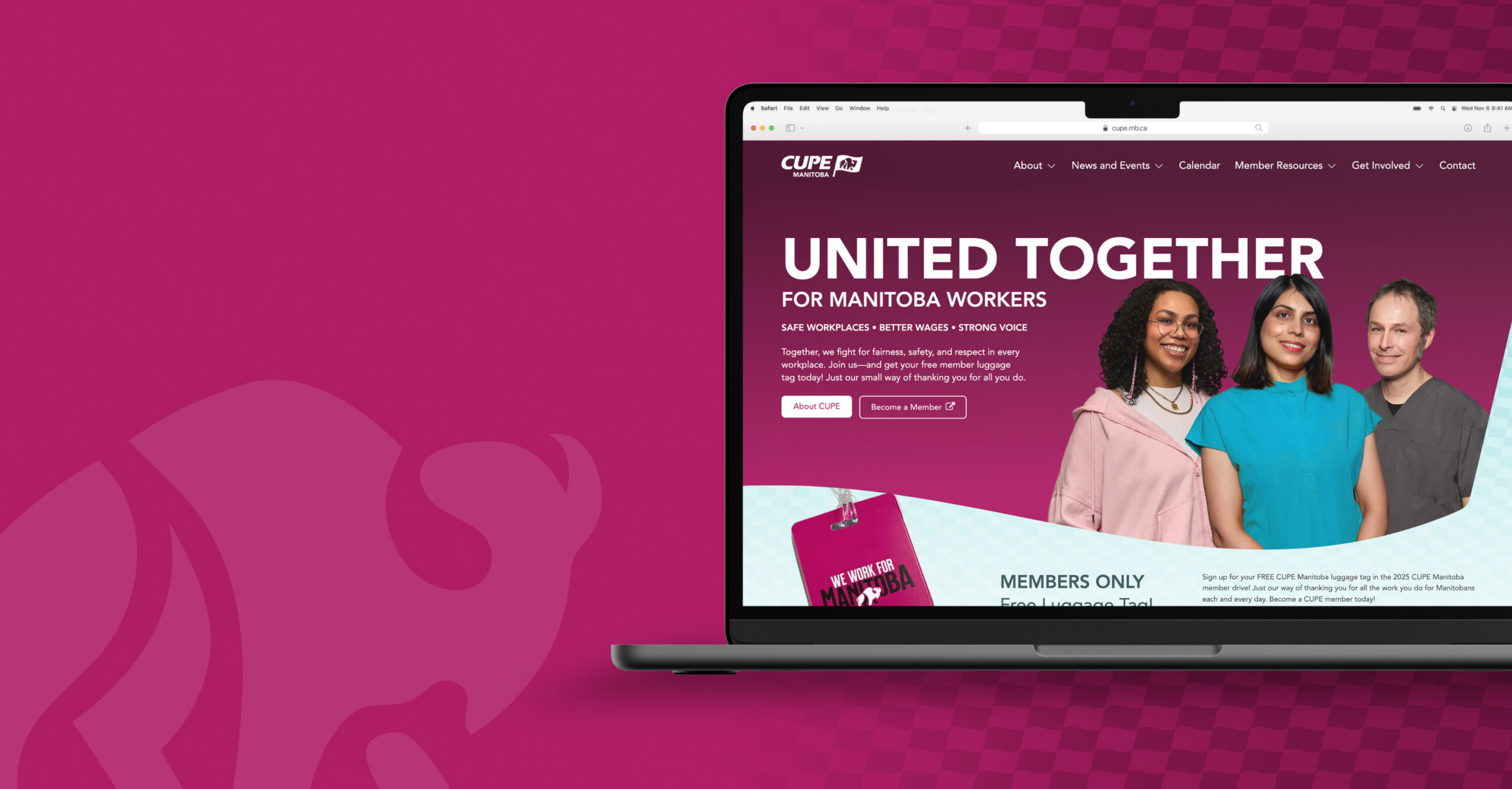
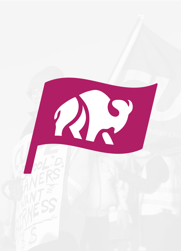
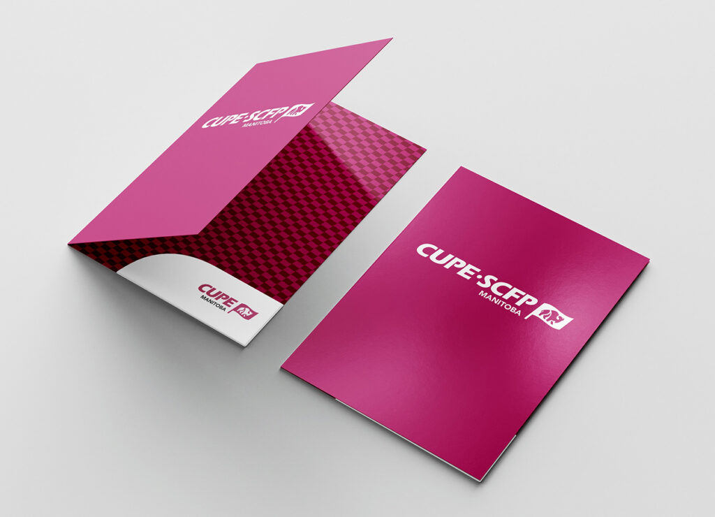
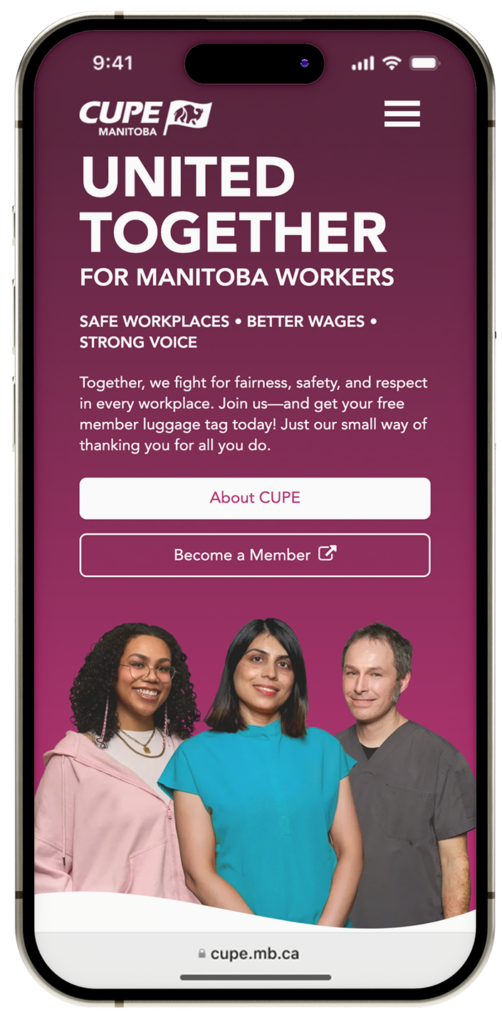
The project delivered a refreshed identity and digital presence that CUPE Manitoba was proud to embrace. The new logo aligns with CUPE’s brand guidelines, pairing the official “CUPE” wordmark with “Manitoba” in Avenir for consistency and recognition. A waving flag element, featuring a bison, symbolizes Manitoba’s heritage and identity while also representing the strength and unity of the union. Alongside this, the modernized website exceeded expectations—an engaging, accessible platform that both CUPE and its members were excited to use.


Content
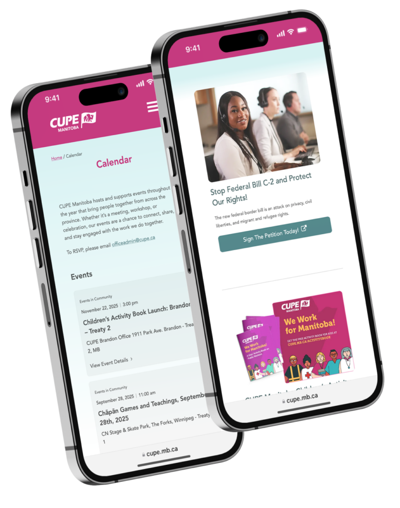
The website’s content strategy was designed to serve CUPE Manitoba’s diverse audiences, from local union members and labourers to government policy-makers, media, and the general public. To ensure accessibility, all messaging was written in plain, straightforward language, making information easy to understand and navigate. While much of the content involved careful review of existing material, Vincent Design also created new content where needed to strengthen the user experience and improve upon the outdated website.
Design
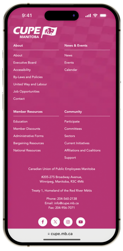
The refreshed visual identity and website design for CUPE Manitoba carefully balanced brand consistency with strong symbolism. For the logo, Vincent Design recreated the official mark following CUPE’s brand guidelines, pairing the CUPE wordmark with “Manitoba” in Avenir. A waving flag containing a bison was introduced to represent both Manitoba’s identity and the strength and unity of the union. This flag shape became a key design element across the website, framing the hero image and serving as section dividers to create cohesion. Anchored by CUPE’s primary pink and supporting colours, the design remained true to brand guidelines while spotlighting photos of union members throughout—placing people at the heart of the organization’s story.
User Experience
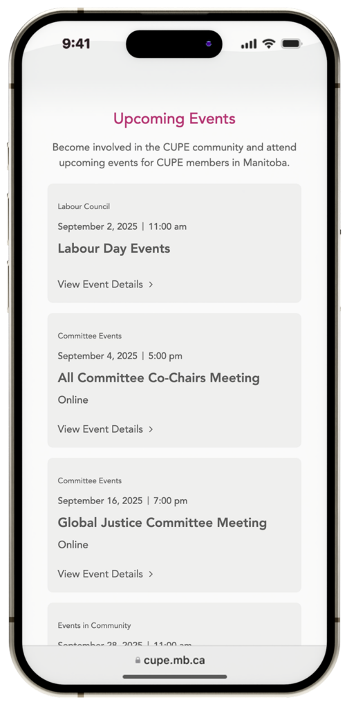
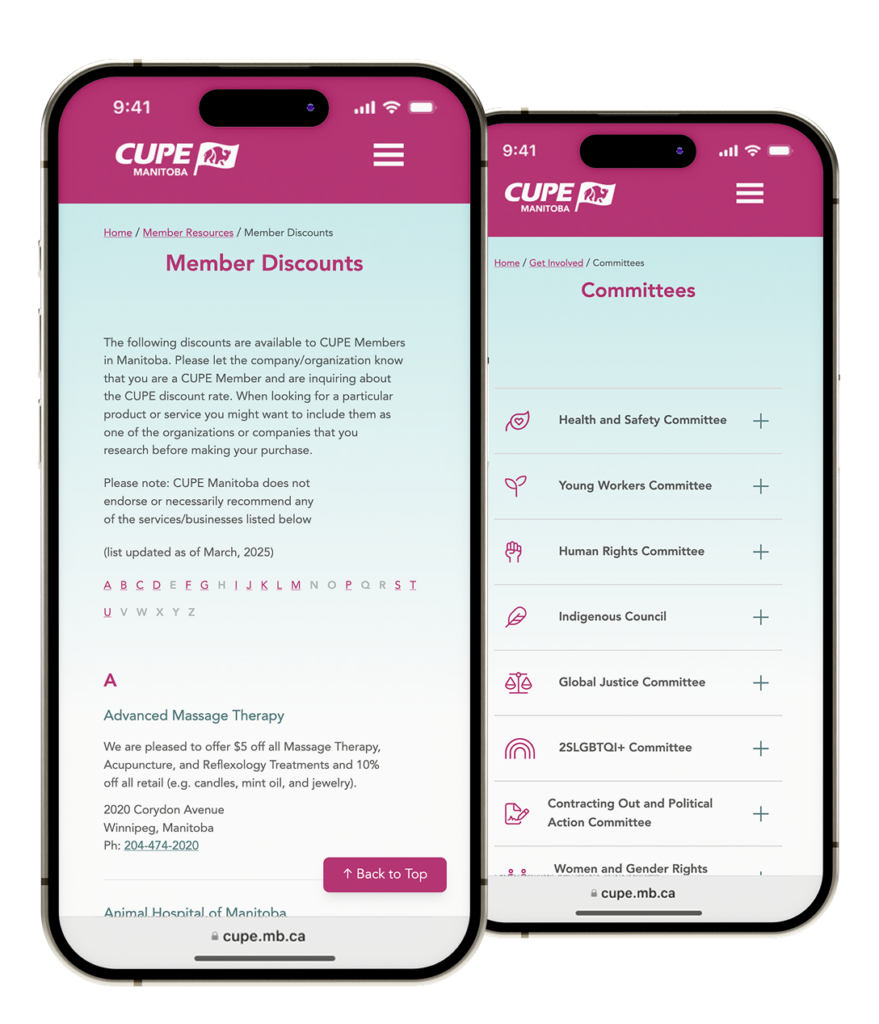
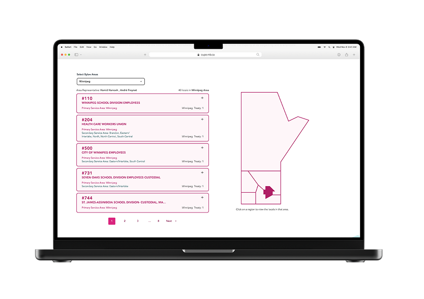
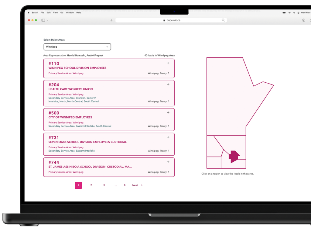
A key focus of the CUPE Manitoba website redesign was enhancing the overall user experience by carefully reviewing both content and design flow. The team worked to make the site easier to navigate, more intuitive, and simpler to update, addressing pain points from the previous website. New functionality, such as an interactive locals map, allows members and the public to quickly find local union chapters. Improved information management systems were implemented for board member details, ensuring accuracy and accessibility. Large, content-heavy areas like member discounts were reorganized and formatted for clarity and easier maintenance.
Additionally, committee and sector information—which had previously been scattered across numerous thin pages—was consolidated and streamlined, creating a more cohesive, user-friendly experience for all audiences. Every aspect of the site was designed with both accessibility and usability in mind, ensuring that members, staff, and external audiences could quickly find and understand the information they needed.
Web Development and Custom Features
The CUPE Manitoba website included several custom-developed features to improve functionality and content management. A members’ map was created to help users quickly locate their local chapters, complete with updated local representative information. A custom system was built to manage the member discounts program, allowing staff to easily add or remove discounts; the discounts page automatically populates based on this data. Similarly, a system for managing board members and their details was developed, using the same custom data approach. A resource area was also implemented to centralize important information for members and the public.
Across these features, custom data types with tailored editor workflows were used to maintain flexibility while staying as close as possible to standard WordPress functionality. Additional custom accordion blocks were created for committees and sectors, enabling maximum information density with minimal pages and effort, streamlining navigation and improving user experience.