Branding • Logo
T.E. Wealth
Briefing
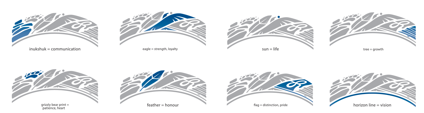
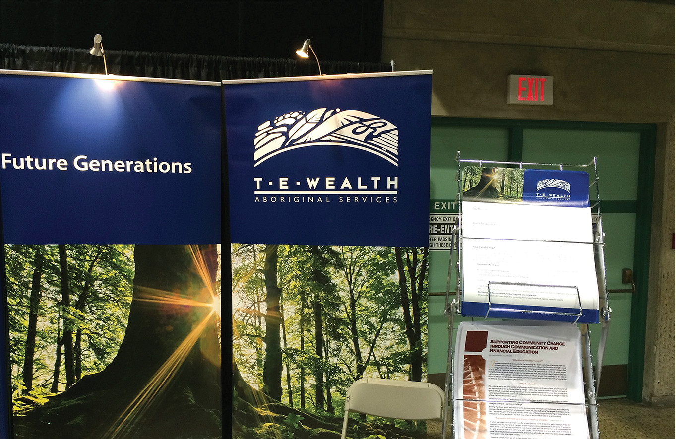
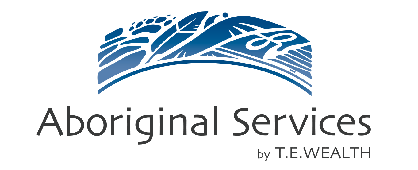
T.E. Wealth were looking for a new brand for their Aboriginal department, one that could singularly represent many First Nations while fitting seamlessly within the company’s existing brand and visual identity colours.
Approach
We choose a careful selection of images symbolic to most communities and that fit within the design shape: the skyline reveals familiar elements, spiritual reflection and peace, all tied together in a cool blue palette.
Responsibilities
- Branding
- Logo
Client